There is no better example of the selling power of packaging design than that of wine labels. In this article, you’ll see some successful examples of wine labels, great wine packaging solutions, and tips on how to please your customers by choosing the right label for your wine brand.
At least once in our life, we have all found ourselves buying a bottle of wine. Hundreds of options, countless labels, bottles, and prices only add to confusion and indecision.
Having a specific budget doesn’t help either, because the choice is still wide.
So it’s no surprise that a wine bottle’s label and packaging design determine the buyer’s choices.
What are the main functions of wine labels?
If food packaging is the undisputed protagonist on the shelves of every supermarket, when it comes to wine bottles the saying “judge a book by its cover” is even more crucial. The choice of wine, in fact, is often dictated by the appearance of the bottle.
This brings us to the first function of the label: design
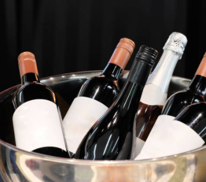
The first aspect that you notice about wine is that of its packaging. In most cases, it’s the bottle (although you’ll see the benefits of packing the bottle in a branded box at the end of the article). Wine bottles aren’t the most creative product packaging. In fact, most of these are regular 0.7 bottles.
However, there are exceptions. The Blood of Grape design is a heart-shaped bottle, crafted with true “anatomical” level details. It is an extremely eye-catching design and is often taken as an example as the quintessential benchmark when it comes to creative wine bottles.
Blood of Grapes is a unique example though. Most wineries choose bottles with more regular shapes because it reduces the problems with outer packaging and logistics.
Because of these common and regular shapes, it is the labels that grab the customer’s attention.
As for the design, a label must communicate whether the wine is aimed at young people who love fresh and original tastes or fans of traditional products with a long history behind them.
“The charm of the bottle and label design is increasingly important for wine lovers when they choose which wine to buy (…). In this way, more creative shapes, icons, and colors will find space, all designed to stand out and oriented to capture, visually, the consumer, while remaining within the reassuring confines of classical aesthetics “.
The second important feature of wine labels is the general description.
Cos ì as n on all of us judge the book by its cover, so some customers have a more thorough knowledge of wines.
Such a customer wants to find all the fundamental information about wine, for example, what is its strength, what is the grape variety, etc. What’s more, the question arises: is it an exclusive product? Can I enjoy it for dinner or is it a dessert wine? Can I give it away or should I look for a more refined solution?
The question is, how can you attract these kinds of people?
The answer is: with descriptions.
When it comes to descriptions, many labels are very elaborately written. In addition to basic information, they often tell the story of the production process, carefully selected grape varieties, and floral scents.
“An elaborate level of information evoked higher expectations before tasting the wines in question, as well as higher results in terms of satisfaction, arousing more intense and less negative emotions.”
The description must engage the customer, just like the well-written text on a website. This is where the brand promise is reinforced (after the initial point of contact, with the label and package design).
Styles of wine labels
Just like packaging design in general, wine labels vary a lot in terms of style. The four most popular ideas are those that:
- create a link with history and tradition
- they use abstract art and design
- they focus on the minimalist look
- refer to trends or use a witty and eye-catching design
Let’s see them through the following examples.
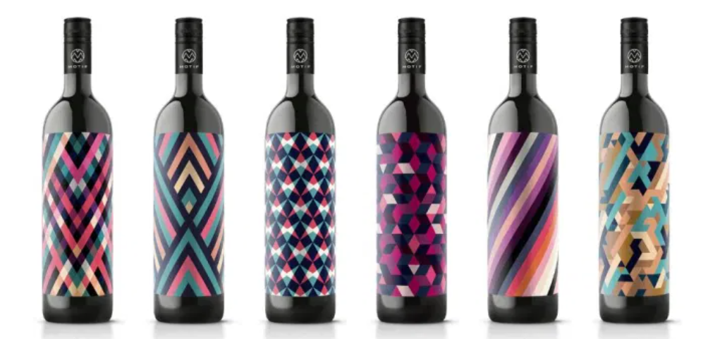
Abstract shapes in the design of wine labels
An abstractly designed wine label is an original way to grab the attention of a confused buyer. Of the many labels that “attack” the buyer with foreign names, suffocating images, and designs, an abstract form is most unexpected.
By “abstract designs” we mean asymmetrical shapes, artistic graphics, and typography that uses contemporary fonts.
A fantastic example of an abstract label design is the Australian brand, Jake Busching. The bluish label, with colors reminiscent of grapes, is one of a kind.
Minimalism in wine labels
Minimalism might be one of the most popular design trends nowadays, and it’s adopted everywhere: from interior décor to packaging.
Minimalist wine labels tend to reduce the space not only of the graphics and printed text but also of the shapes of the labels themselves.
Minimalism is also understood as a simple play of colors. The design you see below has the iconic contrast between black and white as its strong point. With no other detail to dwell on, this bottle defines a completely new approach to wine labels.
A modern approach: be witty or mischievous
Last, but certainly not least, is the broad contemporary design category of wine labels. And here are all the ideas that try to grab the customer’s attention by being captivating, funny, cheeky, or memorable.
Some examples will make the idea better.
Australian brand Elderslie Hill based the design of wine labels on the artistic portraits of its founders. The portraits, for ò, were “crushed” to form a mosaic. Deep, dark colors combined with a subtle silver print with the brand name create one of the most glamorous designs in the industry.
Some winemakers prefer playful phrases, pictures, or drawings that capture their attention because it is fun.
Other brands have come up with even more creative ideas. Like the Boarding Pass Shiraz, an Australian red wine, which transforms the label into the boarding pass, while the back one shows the safety signs on board a plane.
Designing wine labels: how do you manage to be creative?
It often happens that you want to add new elements to your label. For example, if you find yourself producing a special reserve of your best wines, the right way to celebrate it is thanks to a brand new label.
Hot stamping, for example, is a method of adding a layer of colored foil to a cardboard or paper layer in the printing process.
This method is widely used in packaging production, but wine labels can also be finished with hot stamping.
The subtle brightness of silver or gold (the most popular choices) adds a more unique font and can be successfully used in wine label typography (such as letters or logos).
Wine packaging: the need for a beautiful bottle
While the less expensive wines are often sold in supermarkets or on the shelves of shops, there are special packaging for quality bottles à.
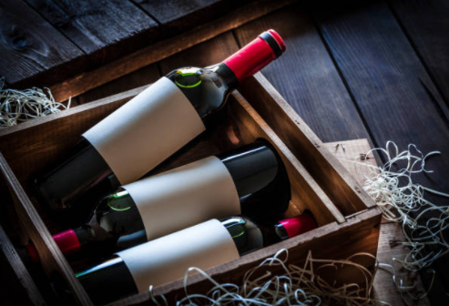
Wine packages have always been mostly wooden crates, filled with shavings to give an even more precious character.
However, for reasons related to sustainability à, many wine producers now rely on cardboard packaging. And it is important to choose the right supplier who is able to make them in different types: white cardboard, kraft, glossy finish, and much more.
The bottle packaging can also have a reproduction of your wine shop logo. Considering that wines are often bought with the aim of being given away, their branding function becomes exponential.
And if the bottle is accompanied by wrapping with an ecological gift bag and with your own brand, the unpacking experience for your customer doubles.
Conclusions
The wine market depends on many variables, but remember that even with a top-quality product, the success of the sale is determined by an original and creative label.
In this article, you’ve seen some great examples of wine label designs: from contemporary and minimalist, from vintage to abstract. There is certainly no shortage of ideas to base on!
And if you want to give a new look to the packaging of your wine bottles, create your own custom boxes to make your brand shine.
Another article on this blog that may interest you: